What Font Size for Subtitles? Use the Frame Height Ratio
"Set the size to 24" is meaningless by itself. The same 24 renders one way on a 720-high canvas and another on a 1920-high canvas — worlds apart visually. The correct baseline for font size isn't fixed pixels but "percentage of frame height": change the ratio, change the device, and the look stays consistent — and one parameter set can govern multiple placements.
Why fixed pixels mislead
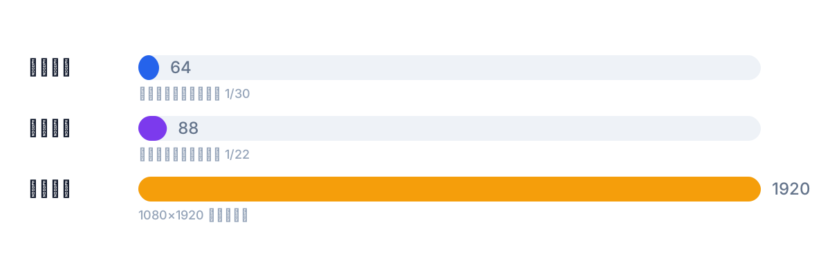
Subtitles end up overlaid on video, and video renders at different resolutions. The same 24 px occupies about 1/30 of the height on a 720×1280 vertical frame but only about 1/45 on a 1080×1920 one — the latter clearly too small to read.
So memorizing "24 px" is useless; memorize the ratio to frame height, and the font size follows the canvas. Preview resolution in editing software often differs from the final export resolution too — sizing against the preview is a classic way to get burned.
How to convert with the ratio
Rule of thumb: one-line subtitle size at 1/30 to 1/22 of frame height. Converting:
- 1080×1920 vertical: 1920 × (1/30 ~ 1/22) ≈ 64–88 px
- 720×1280 vertical: 1280 × (1/30 ~ 1/22) ≈ 43–58 px
- Two-line subtitles at 1080×1920: count total height as 2×, and keep the whole subtitle block under 1/6 of frame height
The formula is one line: size = frame height × ratio. Change the ratio, recompute — no feel required. Precompute the ratios for your common formats and keep them in a note; next time just plug in. Ratio fixed, device changes hold no fear.
Two lines and subtitle-block height
Bilingual or long sentences push subtitles to two lines. Two constraints to hold: max two lines per cue, and the whole block under 1/6 of frame height; for two lines, count total height as both lines combined — don't set both lines at the size ceiling.
Size to the longer line to keep the wider language from wrapping into three. In bilingual pairs, English usually runs wider than Chinese; sizing by the English line keeps the Chinese from looking oversized, and the pair stays balanced.
Do landscape and vertical need separate settings?
Yes. The same asset reads at different sizes in landscape vs vertical: vertical fills the screen — the ratios above apply as-is; landscape on a phone is letterboxed and shrunk, so the same percentage looks smaller and the ratio shifts up one notch. Don't reuse the vertical numbers.
So one parameter set can't blanket every placement — compute per target format. Shipping to multiple platforms: list each target's format first, set the ratio per one.
Beyond font size
Size is one readability dimension; two more: contrast — outline, shadow or a backing bar on bright backgrounds; display time — the right size means nothing if the cue vanishes too fast. This site's thresholds: 1–7 seconds per cue, Chinese under 9 chars/second, Latin under 20 chars/second. Read all three together; sizing alone trades one failure for another.
Before the final cut, run the subtitle checker to flag overlong and overspeed cues; a wholesale timeline offset slides with the timeline shift tool. For burn-in vs platform subtitles, see burned-in or soft subtitles.
Save the ratios as presets
Compute each format's ratio once and record it, then just apply: 1080×1920 vertical, size ≈ frame height × (1/30 ~ 1/22); 720×1280 vertical, same ratio, smaller base; multi-platform landscape, list target formats first and set per one — not one tier for all.
If you'd rather not test per cue, start at 1/26 of frame height, export a short clip and view it on the target device; too small, move toward 1/22; too big, toward 1/30. Once a value is settled, keep it uniform across the video — don't tweak per cue. Shipping to multiple platforms: system font rendering differs subtly between devices, and the real-device preview is final.
FAQ
What px value should I set?
Don't memorize px — memorize the ratio: one line at 1/30 to 1/22 of frame height. 1080×1920 vertical ≈ 64–88 px; 720×1280 ≈ 43–58 px. For a new format, recompute with frame height × ratio.
Should two-line subtitles shrink the font?
Not automatically — but count total height as two lines and keep the whole block under 1/6 of frame height. Size by the longer line to avoid wrapping.
Same size ratio for landscape and vertical?
Not quite. Vertical full-screen uses the ratios above; landscape on a phone renders smaller overall, so shift the ratio up a notch. Compute per target format.